WHAT IS A BOX AND WHISKER PLOT?
Quality Glossary Definition: Box and whisker plot
Also called: box plot, box and whisker diagram, box and whisker plot with outliers
A box and whisker plot is defined as a graphical method of displaying variation in a set of data. In most cases, a histogram analysis provides a sufficient display, but a box and whisker plot can provide additional detail while allowing multiple sets of data to be displayed in the same graph.
WHY USE A BOX AND WHISKER PLOT?
Box and whisker plots are very effective and easy to read, as they can summarize data from multiple sources and display the results in a single graph. Box and whisker plots allow for comparison of data from different categories for easier, more effective decision-making.
WHEN TO USE A BOX AND WHISKER PLOT
Use box and whisker plots when you have multiple data sets from independent sources that are related to each other in some way. Examples include:
- Test scores between schools or classrooms
- Data from before and after a process change
- Similar features on one part, such as camshaft lobes
- Data from duplicate machines manufacturing the same products
HOW TO MAKE A BOX AND WHISKER PLOT
The procedure to develop a box and whisker plot comes from the five statistics below. You can also download the box and whisker plot template.
- Minimum value: The smallest value in the data set
- Second quartile: The value below which the lower 25% of the data are contained
- Median value: The middle number in a range of numbers
- Third quartile: The value above which the upper 25% of the data are contained
- Maximum value: The largest value in the data set
For example, given the following 20 data points, the five required statistics are displayed.
| Number | Data | |
| 1 | 113 | Minimum value: 113 |
| 2 | 116 | |
| 3 | 119 | |
| 4 | 121 | |
| 5 | 124 | |
| |
| 2nd quartile: 124 |
| 6 | 124 | |
| 7 | 125 | |
| 8 | 126 | |
| 9 | 126 | |
| 10 | 126 | |
| |
| Median value: 126.5 |
| 11 | 127 | |
| 12 | 127 | |
| 13 | 128 | |
| 14 | 129 | |
| 15 | 130 | |
| |
| 3rd quartile: 130 |
| 16 | 130 | |
| 17 | 131 | |
| 18 | 132 | |
| 19 | 133 | |
| 20 | 136 | Maximum value: 136 |
Note: For a data set with an even number of values, the median is calculated as the average of the two middle values.
The data represented in box and whisker plot format can be seen in Figure 1.
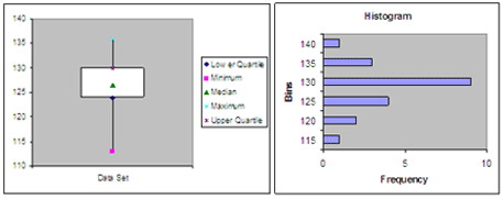
Figure 1 Box and Whisker Plot Example
Left figure: The center represents the middle 50%, or 50th percentile of the data set, and is derived using the lower and upper quartile values. The median value is displayed inside the "box." The maximum and minimum values are displayed with vertical lines ("whiskers") connecting the points to the center box.
Right figure: For comparison, a histogram of the data is also shown, showing the frequency of each value in the data set.
BOX AND WHISKER PLOT EXAMPLE
Suppose you wanted to compare the performance of three lathes responsible for the rough turning of a motor shaft. The design specification is 18.85 +/- 0.1 mm.
Diameter measurements from a sample of shafts taken from each roughing lathe are displayed in a box and whisker plot in Figure 2.
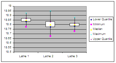
Figure 2 Box and Whisker Plot Lathe Comparison Example
- Lathe 1 appears to be making good parts, and is centered in the tolerance.
- Lathe 2 appears to have excess variation, and is making shafts below the minimum diameter.
- Lathe 3 is performing with relatively less variation than Lathe 2; however, it is centered on the lower side of the specification and is making shafts below specification.
SUGGESTED READING


